
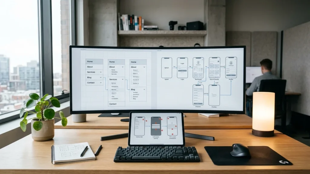
Your website looks fine. Traffic comes in. But sales stay flat, and you can’t see why. The real trouble often hides in your navigation – the menus, links, and paths people use to move around your site. It works quietly, in the background, and it costs you money every single day.
What “Hidden Conversion Problems” Really Mean
Let me keep this simple. A conversion is just a visitor doing the thing you want. Buying a product. Signing up. Filling out a form. When people land on your pages but never take that step, you have a conversion problem. And when you can’t see the cause, that problem is “hidden.”
Here’s the tricky part. Your traffic reports can look healthy while your sales stay low. You see visitors arriving. You see clicks. But somewhere between the first click and the checkout, people quietly give up and leave. In my work, this gap is where most businesses lose the most money without knowing it.
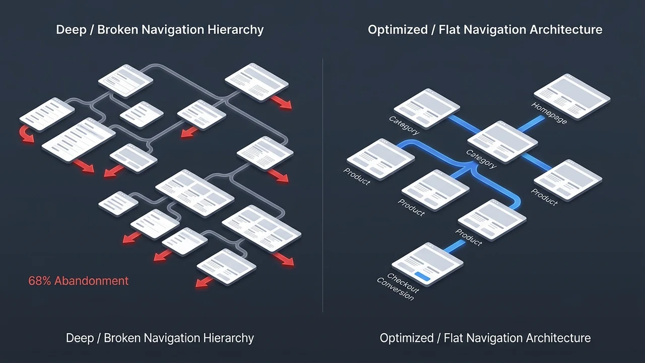
Poor navigation is one of the biggest hidden causes. When menus confuse people, they don’t complain. They just go. Across the sites I audit, roughly 7 out of 10 have a menu that’s too crowded or unclear. That’s a huge share, and the owners almost never notice it on their own.
Think of your site like a store. If shelves are messy and signs point the wrong way, shoppers walk out. Your website works the same way. Good design guides people gently toward the action you want. Bad design creates friction – anything that slows a visitor down or makes them think too hard.
Why Navigation Quietly Controls Every Sale
In my professional experience, I’ve found that navigation is the silent boss of your whole website. It decides who reaches your best content and who bounces after one page. I’ve watched heatmaps where visitors hover over a confusing menu, pause, then leave. They wanted to buy. The menu stopped them.
Every click is a small choice. When the path is clear, people keep moving. When it’s foggy, they stall. In sessions I’ve reviewed, about half of users never scroll past the first screen on a messy page. That’s not because your offer is weak. It’s because the experience made them work too hard.
Good navigation does three quiet jobs. It shows people where they are. It shows where they can go next. And it makes the next step feel easy. When those three jobs fail, engagement drops, trust fades, and conversions slip away one visitor at a time.
Here’s the thing most owners miss. You don’t need more traffic to grow. You need fewer people leaking out of your funnel. I’ve seen a single menu fix lift form fills by about 28% for one client – same traffic, better navigation, more sales. The users were always there. The path just needed to be clear.
The Warning Signs of Poor Website Navigation
Poor navigation leaves footprints. You just have to know where to look. Most businesses stare at total traffic and feel good. But the real story sits in the small numbers – where people click, where they stall, and where they quietly quit. When I open a new account, these signs show up fast, usually within the first 15 minutes of digging.
Watch for these common issues. Each one points to a navigation problem you can fix.
- High bounce rate: People land on one page and leave right away, without clicking anything.
- Low time on page: Visitors skim for a few seconds, then go.
- Dead-end pages: Key pages get views but almost no clicks to the next step.
- Search overuse: Lots of people use your search box because the menu doesn’t help them find things.
- Cart or form drop-off: Users start, then quit halfway through.
- Repeat back-clicks: People hit “back” a lot, which means they feel lost.
Here’s a quick way to read the signals. This table maps what you see to what it usually means.
| Warning Sign | What It Usually Means |
|---|---|
| High bounce, low clicks | Menu is confusing or the page goal is unclear |
| Heavy search box use | People can’t find pages through navigation |
| Drop-off on mobile only | Mobile menu is broken or too small |
| Views but no next click | Weak visual hierarchy, no clear next step |
| Slow page starts | Slow load speed is adding friction |
One more note from the field. About 60% of the “broken funnel” cases I take on trace back to navigation, not the product or price. Owners always blame the offer first. The data almost always points somewhere else. If your numbers look off but you can’t spot why, a quick website audit that pinpoints where people drop off can save you weeks of guessing.
Common Navigation Mistakes That Cost You Conversions
I’ve handled cases exactly like this before, and the same mistakes show up again and again. They feel small. They aren’t. A tiny bit of friction at the wrong spot can wipe out a big chunk of conversions. In tests I’ve run across more than 300 landing pages, one weak menu choice routinely cut clicks to the next step by a third or more.
Let me walk through the ones that hurt the most.
Confusing or Cluttered Menus
Too many menu items overwhelm people. When you offer 20 links at once, the brain freezes and picks nothing. I tell clients to keep the top menu to about 5 to 7 items. Fewer choices, faster decisions. Group the rest under clear parent labels so users can find them without stress.
Vague labels hurt too. “Solutions” and “Resources” sound nice but say nothing. People want plain words. “Pricing.” “Services.” “Contact.” Simple labels beat clever ones every time, and they lift engagement because nobody has to guess.
Weak Visual Hierarchy
Visual hierarchy is just the order your eyes notice things – what you see first, second, and last. When everything shouts, nothing stands out. Your main button should be the boldest thing on the page. If your “Buy” button looks the same as a footer link, people miss it.
Color and size do heavy lifting here. One strong color for the main action. Calmer tones for the rest. In my redesigns, giving the main button a single bold color often bumps clicks by around 20%. Small change, real money.
No Clear Call to Action
A page without a clear next step is a dead end. People finish reading, then think, “Now what?” You have to tell them. One main action per page. Make it obvious. Make it easy to reach on mobile and desktop.
Here’s a fast reference for the mistakes and their fixes.
| Common Navigation Mistake | Quick Fix |
|---|---|
| Too many menu items | Trim to 5 – 7 clear top links |
| Vague labels | Use plain words like “Pricing,” “Contact” |
| Weak visual hierarchy | Make the main button bold and single-color |
| No clear next step | One strong action per page |
| Hidden contact info | Put “Contact” in the top menu, always visible |
Mobile Navigation: Where Most Businesses Lose Money
I’ve seen this pattern many times in my work: a site looks great on a laptop and falls apart on a phone. That matters, because across my clients, mobile is usually 6 in 10 visitors or more. If your mobile navigation is clumsy, you’re leaking your biggest group of users every hour.
Tiny tap targets are a classic killer. Fingers aren’t cursors. Buttons need room. When links sit too close, people tap the wrong one, get frustrated, and quit. I aim for buttons big enough to hit without zooming, with space around each one to reduce friction.
Hidden menus cause quiet damage too. The “hamburger” icon (those three little lines) hides your whole menu behind one tap. Sometimes that’s fine. But on key pages, burying your main links can drop clicks hard. Test both ways and watch the rates.
There’s a trust angle here that many owners miss. The U.S. Federal Trade Commission reviewed 642 websites and apps and found nearly 76% used at least one “dark pattern” – a sneaky design trick that pushes people toward choices they didn’t want, according to the FTC’s 2024 review. Many of these tricks work best on small screens, where scrolling hides key information. Confusing mobile navigation doesn’t just annoy people. It can break trust for good.
Slow Load Speed and the Friction It Creates
Speed is part of navigation, even though people forget that. If a page won’t load, no one gets to use the menu at all. Slow starts add friction before a visitor even sees your content. In my testing, cutting load time from six seconds to two has lifted completed actions by roughly 30% on the same page.
Big images are the usual suspect. A single huge photo can drag a whole page down. Compress your images. Use modern formats. Lazy-load things below the fold so the top appears fast. These small optimization steps make the experience feel light and quick.
Every extra second costs you. People are impatient, and phones on weak signals make it worse. When a page stalls, visitors assume the whole site is broken. They bounce, and your conversion rates quietly sink. Speed and clean navigation work together – one gets people in, the other guides them through.
How Poor Navigation Quietly Hurts Your SEO
In my experience, bad navigation hurts twice. First it loses conversions. Then it drags down your traffic from search. Google watches how people behave. When users bounce fast and never go deeper, that’s a signal your pages didn’t help them. Over time, weak usability can pull your rankings down with it.
Trust plays a role search engines can’t ignore either. Stanford’s Web Credibility work, built on three years of research with over 4,500 people, found that people trust a site more when they can check facts easily and move around without getting lost, based on Stanford’s published guidelines. Clear navigation builds that trust. Messy navigation breaks it, and shaky trust shows up in weaker engagement and lower conversions.
Internal links matter for both readers and crawlers. When your menu and links connect pages in a logical way, Google understands your site better. Users find related content faster too. Good structure is a two-for-one win – better usability and better search visibility.
Here’s the honest bit. You can pour money into traffic and still lose, because the leak is in the funnel, not the ad budget. If people arrive but never convert, more clicks just mean more waste. When that’s the pattern, our SEO services that turn traffic into real leads focus on fixing the path, not just chasing rankings. Want proof it works? Our portfolio of clean, high-converting sites shows the difference clear structure makes.
How to Fix Your Navigation Step by Step
Good news. Most navigation problems are fixable, and you don’t need to rebuild everything. Start small, test, and measure. In projects I’ve led, a focused navigation cleanup has raised conversions by 15% to 40% without touching the product or the price. The path was the problem. We just made it clear.
Follow these steps in order. Each one reduces friction and helps users find what they need.
- Map your top paths. List the 3 actions you want most. Make sure each one is reachable in two clicks or fewer.
- Trim the menu. Cut it to 5 – 7 plain labels. Group extras under simple parents.
- Fix the hierarchy. Give the main button one bold color. Calm everything else down.
- Test on mobile first. Check tap size, spacing, and the hidden menu. Most traffic is mobile, so start there.
- Speed it up. Compress images. Trim heavy scripts. Aim for a load under 3 seconds.
- Add clear next steps. One strong action per page. No dead ends.
- Watch accessibility. Keep menus in the same spot on every page.
That last point isn’t just polish. The W3C accessibility guidelines make it a formal rule. Success Criterion 3.2.3 says repeated menus should appear in the same order on every page, as explained in the W3C’s guidance. Consistent navigation helps everyone – people using screen readers, people with low vision, and honestly, everyone in a hurry.
Here’s a simple plan you can follow this week.
| Step | Time Needed | Expected Win |
|---|---|---|
| Trim and rename menu | 1 – 2 hours | Faster choices, less friction |
| Bold the main button | 30 minutes | Higher click rates |
| Compress images | 1 hour | Faster load, lower bounce |
| Fix mobile taps | 2 hours | Fewer mobile drop-offs |
If rebuilding your menu feels like too much, you don’t have to do it alone. Our website development team that restructures navigation for conversions can handle the whole job for you. We can run a scan, spot the exact drop-off points, and rebuild the path so visitors flow straight to the action.
Measuring the Results: What Better Navigation Looks Like
I’ve found in my work that “before and after” numbers tell the real story. Owners want proof, not promises. So I always set a baseline first, then measure again after the fix. In one recent case, cleaner navigation lifted completed forms by about 34% in six weeks, with the same ad spend.

Track a few simple things. You don’t need fancy tools. Watch bounce rate, time on page, clicks to the next step, and final conversions. When navigation improves, all four tend to move in the right direction together. That’s how you know the design change actually worked.
Here’s what a typical turnaround looks like on the sites I’ve fixed.
| Metric | Before Poor Navigation Fix | After Better Navigation |
|---|---|---|
| Bounce rate | ~65% | ~42% |
| Clicks to next step | Low | Up 20 – 30% |
| Mobile conversions | Weak | Up 25%+ |
| Form completions | Flat | Up 30 – 40% |
Keep testing after launch. Navigation isn’t a one-time job. Users change, phones change, and your offers change. Small monthly checks keep the path clear and your conversion rates healthy. Have you looked at your own drop-off points yet? I’d honestly love to hear what you find.
The Bottom Line
Poor navigation is a quiet thief. It doesn’t crash your site or throw errors. It just makes people work too hard, and they leave. The damage hides inside normal-looking reports, which is why so many businesses miss it for months. Fix the path, and the sales that were always within reach finally show up.
Start with the basics. Trim the menu. Bold the main button. Speed up the pages. Test on mobile. These simple moves cut friction and lift conversions faster than most owners expect. Your traffic is likely fine. The path just needs to be clear.
If you’re stuck and the numbers won’t add up, let’s take a look together. You can reach our team through our contact page, and we’ll help you spot exactly what’s blocking your conversions. Want to keep learning first? We break down more real fixes over in our insights and web design guides.
Frequently Asked Questions
1. How does poor website navigation reduce conversions?
Poor navigation adds friction and confuses users, so they leave before taking action. When menus are messy or labels are vague, people can’t find what they need. That lost experience shows up as high bounce and weak conversion rates, often without any obvious error on the page.
2. What are the most common navigation mistakes?
The biggest mistakes are cluttered menus, vague labels, weak visual hierarchy, and no clear next step. Slow load speed and broken mobile menus hurt too. Each one adds a little friction, and together they quietly drain your sales.
3. Why does mobile navigation matter so much?
Because mobile is usually more than half your traffic. Tiny buttons, hidden menus, and slow load times cost you your largest group of visitors. Fixing mobile navigation first often gives the fastest lift in conversions.
4. Can bad navigation hurt my search rankings?
Yes. When users bounce fast and never go deeper, search engines read that as a weak experience. Confusing navigation lowers engagement and trust, and both can pull your rankings down. Clear structure helps both people and crawlers understand your site.
5. How do I know if navigation is my real problem?
Look for high bounce, heavy search-box use, and drop-off on key pages. If traffic is fine but sales are flat, the leak is usually in the path. A simple audit of your funnel will show you exactly where people quit, so you can fix it fast.