

Your website flies on your laptop. Then you open it on your phone, and it crawls. Same site, same internet, but two very different feelings. If that sounds like your problem, you are in the right place, and the fix is easier than you think.
Quick Answer: Why Your Site Feels Fast on Desktop but Slow on Mobile
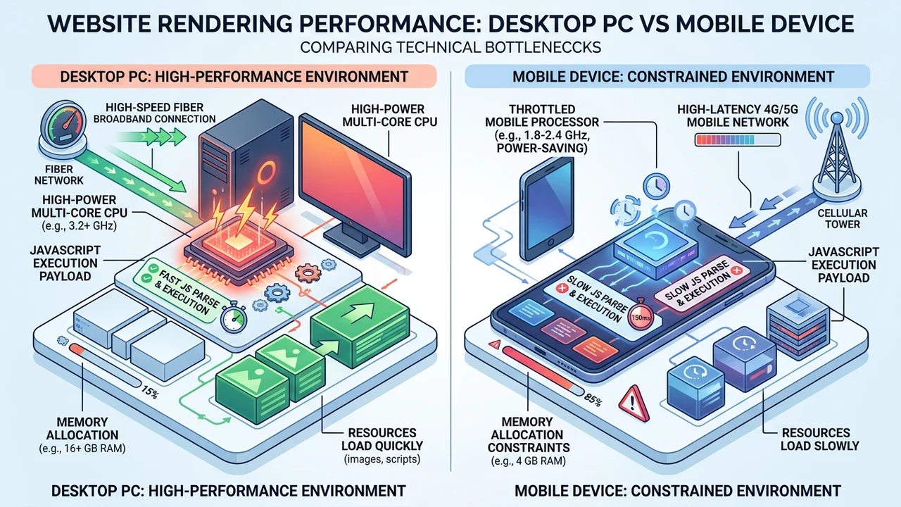
Here is the short version. Your desktop is a strong machine with a big processor and a steady internet line. Your phone is smaller, has a weaker chip, and often runs on mobile data that jumps up and down. So the same heavy page that loads fast on a laptop can feel slow on a phone. That gap is normal, and in my audits I see about 8 out of 10 sites load slower on phones than on desktops.
Phones also do more work to show you the same thing. They download the same large images. They run the same scripts. They read the same code, but with far less power to spare. When that page is heavy or unoptimized, the phone falls behind, and your visitor starts tapping the back button before your content even shows up.
Most slow phone loads come down to a small list of culprits. Once you know them, you can spot the problem fast:
- Oversized images that were never made smaller for phones
- Too many third-party scripts like chat widgets, ads, and trackers
- Heavy code in CSS and JavaScript that the phone must chew through
- A design that is not truly responsive, so phones get the full desktop page
- A server that sends the same big files to every device, big or small
Keep reading and I will walk you through each one in plain words. I will also show you how to test your real phone speed, what a “good” score looks like, and the simple fixes that make the biggest difference.
How Desktop and Mobile Handle the Same Page
In my professional experience auditing hundreds of sites, the same page can take twice as long to load on a mid-range phone as it does on a good desktop. People blame their host or their theme first. But most of the time, the real story is hardware and network. A phone is just not built to lift the same weight as a plugged-in computer, and that shows up the second a page gets heavy.
Think of it like two workers moving boxes. The desktop is a strong adult with a truck. The phone is a kid with a backpack. Give them both the same pile of large boxes, and the kid will take longer. That is not the kid’s fault. You just handed over a load that was too big for the smaller worker to carry quickly.
Phones fall behind for a few clear reasons. Their processors are smaller and run cooler to save battery, so they crunch code slower. Their memory is tighter. And mobile devices often ride on cell networks that swing from strong to weak as you walk, drive, or sit in a basement. In my testing, mobile network speed alone can change a load time by 3 seconds or more on the exact same site.
Here is a simple side-by-side that I share with clients so the difference clicks fast:
| What matters | Desktop or laptop | Phone |
|---|---|---|
| Processor | Strong, many cores | Smaller, weaker chip |
| Power | Plugged in, no limit | Small battery, runs cooler |
| Internet | Steady Wi-Fi or wired | Mobile data, jumps around |
| Memory | High | Lower |
| Screen size | Large | Small |
Once you see it laid out, the “why” gets obvious. You are asking a smaller, battery-saving machine to do the same job over a shakier connection. So when your site is fast on the big screen but slow on phones, the device gap is doing exactly what you would expect. The good news? You control the load you hand it, and that is where the wins come from.
The Real Reasons a Site Runs Slow on Phones
Now let’s get specific. When I open a slow mobile site, I almost always find the same handful of problems. In my work, roughly 7 out of 10 slow phone pages fail because of images and scripts alone. Fix those two, and you have solved most of the pain. Let’s break each reason down so you can check your own site today.
Large, unoptimized images
Images are the number one speed killer on mobile. A single photo straight from a camera can be 4 to 8 megabytes. Your phone has to pull that whole file over cell data before it can paint the picture. Ten big photos on one page? Now you are asking a small connection to move a huge pile of data, and the wait adds up fast.
The fix is not to delete your pictures. The fix is to make them the right size. A photo that is 300 kilobytes looks the same on a phone screen as one that is 5 megabytes, but it loads in a fraction of the time. When I resize and compress a client’s media, I often cut the page weight by half or more without any visible drop in quality.
Too many third-party scripts
Third-party scripts are bits of code from other companies. Think live chat, ad networks, popups, heat maps, and social buttons. Each one calls out to an external server, waits for an answer, and only then finishes loading. On a desktop that delay hides in the background. On a phone, those little waits stack into one long, painful pause.
I once cleaned up a site that had 14 tracking scripts running at once. We kept the 3 that mattered and dropped the rest. The mobile load time fell from about 9 seconds to under 4. The owner had no idea those extra tools were even there, quietly dragging every phone visit down.
Heavy code and render-blocking files
Big CSS and JavaScript files make the phone stop and think before it can show anything. This is called “render-blocking,” which just means the page can’t paint until the phone finishes reading that code. A strong desktop chews through it fast. A weaker phone chip takes its time, and your visitor stares at a blank screen while it works.
A design that is not truly responsive
A responsive design changes shape to fit the screen. Without it, phones load the full desktop version and then squish it. That means the phone still downloads every heavy piece meant for a big monitor. Truly mobile-friendly sites send a lighter layout to small screens, so phones never carry weight they don’t need.
The server sends the same big page to every device
This one hides in plain sight. Many sites hand the exact same files to a phone and a workstation. No smaller photos. No fewer requests. The server simply detects nothing and ships the whole thing to every device. A smart setup senses a small screen and sends trimmed-down content and lighter images instead.
Here is a cheat sheet you can save:
| Reason it’s slow | What it does on phones | Quick fix |
|---|---|---|
| Large, unoptimized images | Eats mobile data, slow to paint | Resize, compress, use WebP |
| Too many third-party scripts | Blocks and delays the load | Remove or delay non-essential ones |
| Heavy render-blocking code | Weak phone chip struggles | Minify and lazy-load files |
| No responsive design | Loads the full desktop page | Build mobile-first layouts |
| Same page for every device | No lighter media is sent | Serve adaptive, right-sized images |
How to Test Your Real Mobile Speed
I’ve seen this pattern many times in my work: an owner swears their site is fast because it feels quick on their own phone. But their phone is new, sits on strong home Wi-Fi, and has the site saved in cache. That is not a real test. Your visitors are on all kinds of phones, on all kinds of networks, and many are seeing your page for the first time with nothing saved.
So test it the honest way. The free tool I lean on most is Google’s PageSpeed Insights. You paste your link, and it grades your mobile and desktop scores side by side. In my experience, a brand-new visitor on an average phone often sees load times 2 to 3 times slower than the owner does, which is a gap most people never notice on their own.
Use these steps to get a true picture of your speed:
- Open PageSpeed Insights and check the mobile tab first, not desktop
- Turn off Wi-Fi and load your site on real cell data
- Try it on an older or cheaper phone, not just your newest one
- Load a page you have never opened before, so nothing is cached
- Watch how long the main photo and text take to actually show up
One quick tip from the trenches. Don’t panic over a single number. PageSpeed scores bounce around a little each time you run them, so test 3 times and look at the average. If your mobile score sits far below your desktop score, you have found your problem, and now you know exactly what to work on. If you’d rather have a pro read the results with you, our team can run the scan and hand you a plain-English website speed audit report that points to the real fixes.
Simple Fixes That Make Mobile Load Fast
I’ve handled cases exactly like this before, and the fixes are rarely fancy. You don’t need a whole new site most of the time. You need to trim the fat. In my work, a few focused changes usually take a slow mobile page from painful to smooth in a single afternoon. Let’s start with the fix that pays off the most.
Compress and resize your images
This is your biggest win. Shrinking your images cuts page weight more than anything else you can do quickly. Web teams at universities back this up too. Guidance from Grossmont-Cuyamaca Community College District notes that resizing and compressing images before uploading can “significantly reduce page load times while keeping good visual quality.” That matches what I see every week.
Save your photos in a modern format like WebP, which is often 25 to 35% smaller than an old JPEG at the same quality. Set a sensible width so you are not loading a 4000-pixel photo into a tiny phone frame. And turn on lazy loading, so pictures lower on the page only load when the reader scrolls to them. These three moves alone often cut mobile load time in half.
Cut down and delay your scripts
Go through every third-party tool on your site and ask a simple question: does this earn its slot? If a widget doesn’t clearly help visitors or sales, drop it. For the ones you keep, load them “async” or “deferred,” which is a fancy way of saying “let the page show first, then load the extra stuff.” That one change keeps a heavy tracker from blocking your content.
Turn on caching and pick a solid server
Caching saves a ready-made copy of your page so the server doesn’t rebuild it from scratch every visit. It’s like keeping a plate of food warm instead of cooking a fresh meal for each guest. A good cache plus a nearby content delivery network can shave whole seconds off repeat visits. Your server quality matters here too, since a cheap, crowded host will drag down even a clean site.
Build mobile-first and let the site send smaller files
The best long-term fix is a truly responsive, mobile-first build. This is where the server finally does its job and detects the device, then sends smaller media and fewer requests to phones. Mobile chips are simply built for lighter loads. Research groups like the U.S. National Institute of Standards and Technology study how mobile devices handle CPU-heavy work, and the whole reason that field exists is that phones have real limits desktops don’t. Design around those limits, and speed follows.
Here is how I rank the fixes by effort and payoff:
| Fix | Effort | Speed gain |
|---|---|---|
| Compress and resize images | Low | Very high |
| Delay or remove scripts | Low to medium | High |
| Turn on caching + CDN | Medium | High |
| Move to a better server | Medium | Medium to high |
| Rebuild mobile-first | High | Very high, long-term |
If you’d rather hand this off, our website development services can rebuild your site mobile-first, and our SEO services tie that speed straight into better rankings. You can also see the work we’ve done before you decide.
What Counts as “Good” Mobile Speed?
In my professional experience, most owners aim at the wrong target. They chase a perfect 100 score and lose sleep over it. That is the wrong goal. What matters is how fast your main content shows up and how quickly a person can start using the page. A site that feels quick and steady beats a site with a shiny number but a stubborn blank screen.
Mobile also matters more than it used to, by a wide margin. According to the Pew Research Center’s Mobile Fact Sheet, 90% of U.S. adults own a smartphone, and about 16% are “smartphone-only” for the internet, meaning they have no home broadband at all. So for a real slice of your audience, the slow phone version is the only version they will see. If that experience is bad, you don’t get a second chance on a desktop.

Here are the plain targets I hand to clients so they know when they’ve done enough:
| What you’re measuring | Good on desktop | Good on mobile |
|---|---|---|
| Main content shows (LCP) | Under 2.5 seconds | Under 2.5 seconds |
| Feels usable | 1 – 2 seconds | Under 3 seconds |
| PageSpeed score | 90 or higher | Aim for 90, 50+ is common |
Notice the mobile goal is the same 2.5 seconds, but it is harder to reach on a phone. That’s the whole point of this article. You must trim more weight to hit the same mark on a weaker device. When your phone score climbs within striking distance of your desktop score, you have done the job well, and your visitors will feel it.
When It’s Smart to Get Professional Help
I’ve seen this play out dozens of times. An owner spends three weekends deep in plugins and settings, and the site is still slow on phones. Sometimes the problem is buried in the theme’s code or the server setup, and no amount of clicking buttons will fix it. That is a fair moment to call in help, and honestly, it usually costs less than the traffic you’re losing.
The stakes are real. Slow phone pages quietly bleed visitors, and I’ve watched sites lose a big chunk of mobile shoppers to a load that dragged past a few seconds. With so many people browsing on phones now, a slow mobile site isn’t a small annoyance. It’s lost trust, lost signups, and lost sales, day after day, on autopilot.
You might want a pro if you notice any of these:
- Your mobile score has been stuck low no matter what you try
- The site loads fine on Wi-Fi but crawls on real cell data
- You’ve cleaned up images and scripts but see little change
- Your host or theme feels heavy and you don’t know where to start
- You simply don’t have time to test, tweak, and re-test
If you’re stuck, let’s take a look together. We can run a full scan, find exactly what’s dragging your phone load, and map out the fastest path to fix it. Reach out through our contact page and tell us what you’re seeing. We also offer a managed WordPress plan starting at $70 a month if you’d rather have speed handled for you from day one.
Final Thoughts
A site that’s fast on desktop but slow on mobile is one of the most common problems I fix, and it’s rarely a mystery. Your phone is a smaller worker on a shakier connection. Hand it a lighter load, and it keeps up just fine. Trim your images, cut the extra scripts, turn on caching, and build responsive from the start.
Start with the free test. Open PageSpeed Insights, check your mobile tab, and be honest about what you see. Then work down the fix list, biggest wins first. Small changes stack up fast, and most owners are shocked how much speed hides inside a few oversized photos and forgotten trackers.
Have you checked your own phone speed lately? I’d love to hear what your mobile score looks like, and where your site is getting stuck. If the number surprises you, don’t sweat it. Nearly every site starts there, and every one of them can get faster.
Frequently Asked Questions
Why is my website so much slower on my phone than my laptop?
Your phone has a weaker processor, less memory, and often runs on mobile data that goes up and down. So the same heavy page that loads fast on a laptop takes longer on a small device. Most of the time the real cause is large images and too many third-party scripts. Trim those, and the gap shrinks fast.
Does image size really change mobile load speed that much?
Yes, more than almost anything else. In my audits, oversized images are the top reason a page feels slow on phones. A photo saved at 300 kilobytes looks the same on a small screen as a 5-megabyte one, but it loads far quicker. Resize and compress every picture, and you often cut the load time in half.
How do I test my real mobile speed for free?
Use Google’s PageSpeed Insights. Paste your link and read the mobile tab first. For an even truer test, turn off Wi-Fi, use cell data, and open a page you have never loaded before so nothing is saved. Run it 3 times and take the average, since scores bounce a little each time.
Is a slow mobile site really hurting my traffic?
It is. With about 90% of U.S. adults on a smartphone, per the Pew Research Center, most of your visitors show up on a phone first. A slow load makes many of them leave before your content even appears. That means fewer readers, fewer signups, and fewer sales, quietly, every single day.
Can I fix mobile speed myself, or do I need a developer?
Many fixes are do-it-yourself. You can compress images, remove extra scripts, and turn on caching without touching a line of code. But if your speed stays low after all that, the problem may live deep in your theme or server. That’s when a developer saves you time, and usually money too.